Reading Muted Sheen And Bright Reflections Through Copper Color and Light
To examine muted sheen and bright reflections, begin with specific designs rather than a general style label. This article focuses on surface observation, using Two Autumn Fruits · Persimmon Branch and Eighteen Arhats · Dragon Tamer to distinguish visible clues from the information that needs a separate check.
Define the question for this comparison
Separate base material, visible color, and photographic shading when discussing a surface. The current design program uses natural brass, natural white copper, and colored brass. A color name describes the appearance being considered; it does not independently establish an inlay, coating process, or alloy formula.
A muted sheen can make ornament easier to read continuously, while bright reflections emphasize changing local areas. One strong photographic highlight does not establish the finish of the entire surface.
First example: Two Autumn Fruits · Persimmon Branch
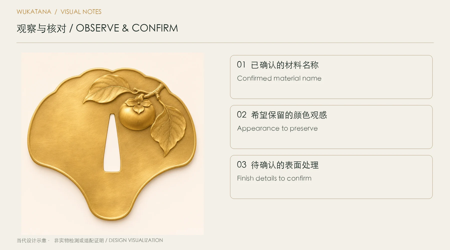
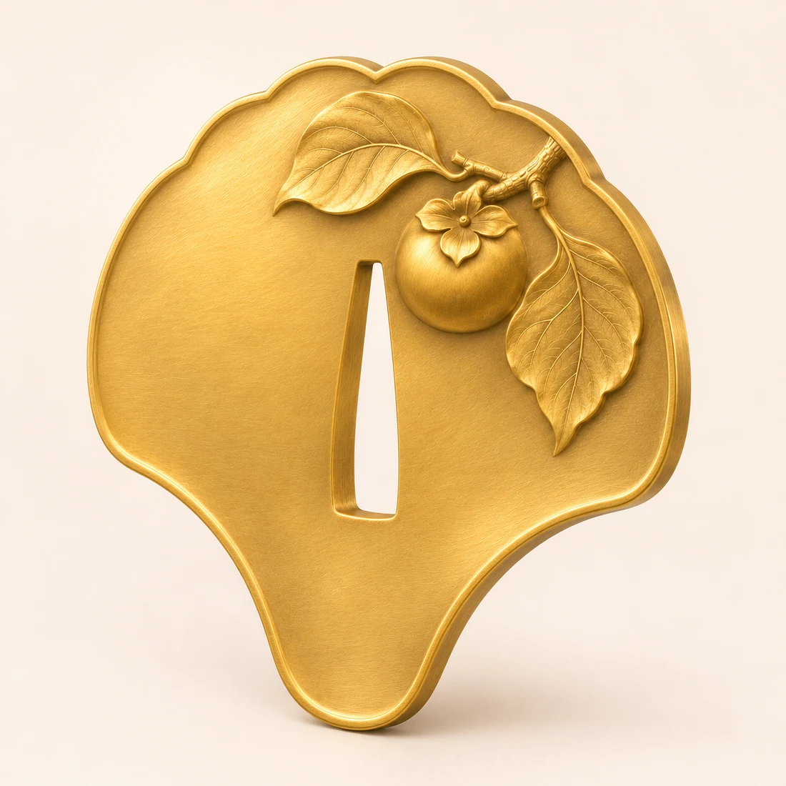
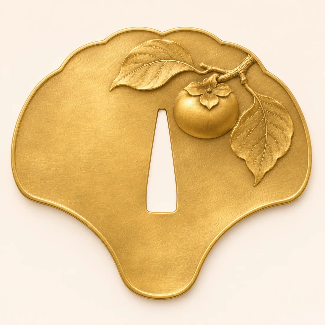
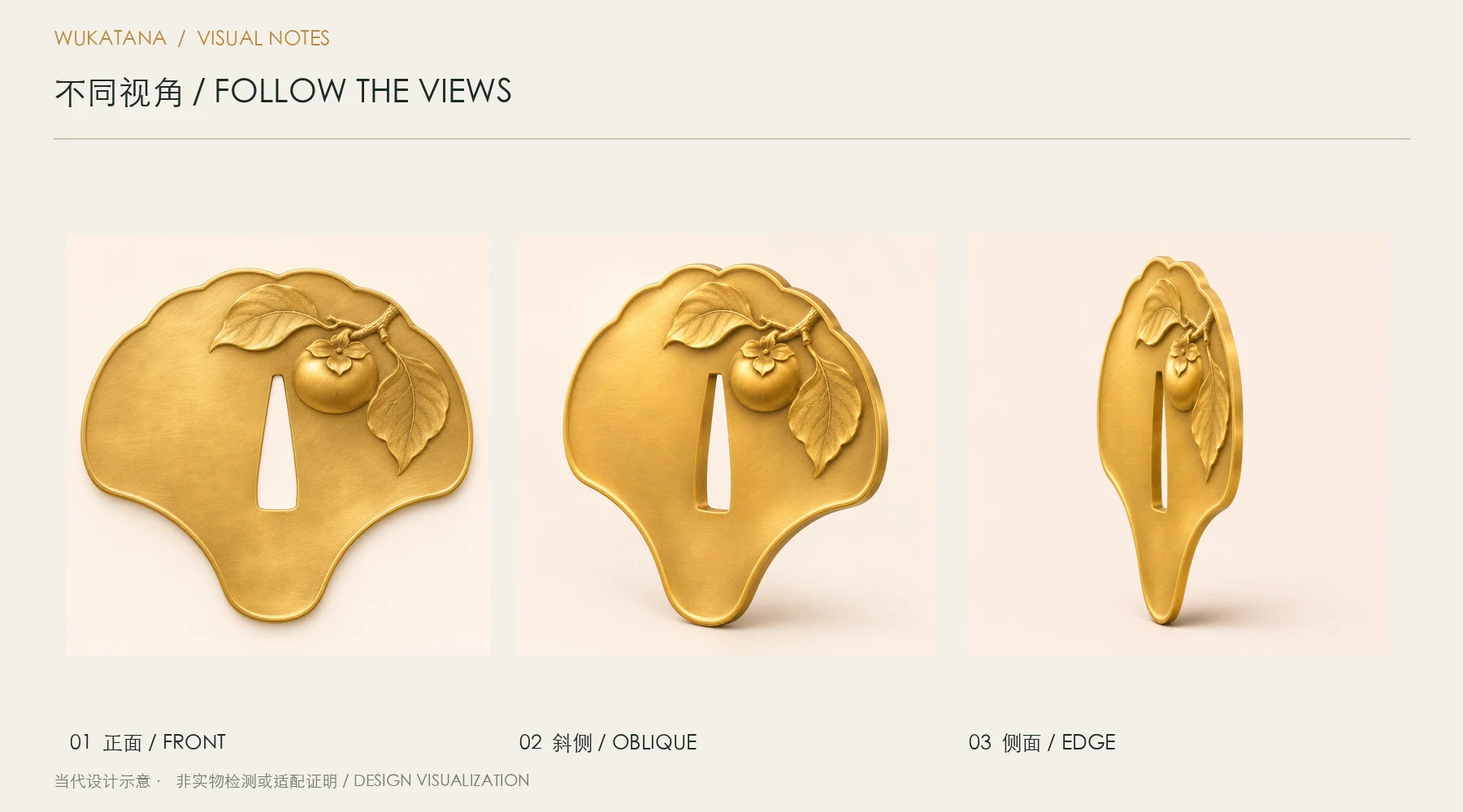
Two Autumn Fruits · Persimmon Branch is cataloged as natural brass, with an organic outline form and fine engraved lines, sculpted relief as its decorative approach.
Branches hold the season; autumn fruit grows round. Two Autumn Fruits · Persimmon Branch uses natural brass. A short branch at the upper right carries a single round persimmon.
Read the ground, raised detail, and rim separately. A brighter area may reflect both its intended surface color and the camera angle. One highlight is insufficient evidence that another metal has been used, so keep the material description tied to the product specification rather than to brightness alone.
Second example: Eighteen Arhats · Dragon Tamer
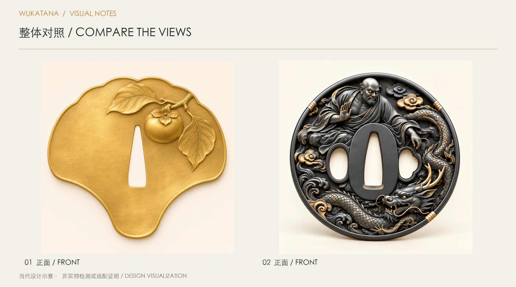
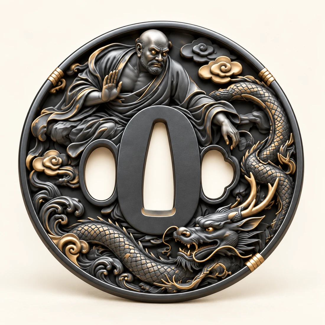
Eighteen Arhats · Dragon Tamer is cataloged as colored brass, with round or oval form and sculpted relief, restrained color contrast as its decorative approach.
Eighteen Arhats · Dragon Tamer develops its story through gesture and a distinctive motif. A seated arhat and a curling dragon form a diagonal relationship, with clouds following the rim. Within the round outline, graphite-black colored brass sets off the robe folds, with restrained warm-brass-colored accents tracing the ornament.
Read Eighteen Arhats · Dragon Tamer on its own terms before comparing it with the first example. Each design retains its cataloged material and composition. If material, outline, and subject change together, record those variables separately rather than attributing every visual difference to one factor.
Turn looking into a repeatable method
Compare at least a front and an oblique view, noting which details remain legible after the highlight moves.
Use the front view to record the dominant color, an oblique view to follow changing highlights, and the edge view to understand the rim. In this catalog, white copper is presented with clean silver-white color and gentle gray depth. Charcoal-colored brass should retain a readable dark form, with accents doing only the emphasis the composition needs.
Keep one clear outcome
For muted sheen and bright reflections, make the record specific to the two designs: mark the first detail you notice in Two Autumn Fruits · Persimmon Branch, then identify a corresponding observation area in Eighteen Arhats · Dragon Tamer. Describe the shapes and relationships first, followed by the preference or question that needs to be resolved.
Keep three separate notes: the confirmed material name, the color appearance you want to preserve, and any finish details still awaiting confirmation. Leaving unverified processes as questions makes later communication more accurate and prevents an observation about appearance from turning into an unsupported technical claim.