A Clearer Way to Compare Fine Lines And Shallow Relief
To examine fine lines and shallow relief, begin with specific designs rather than a general style label. This article focuses on selection, using Bamboo and Stone · Bamboo Sound and Bamboo and Stone · Stone Stillness to distinguish visible clues from the information that needs a separate check.

Define the question for this comparison
Begin by separating the appearance you want from the information that needs confirmation. The first determines the visual qualities to preserve; the second determines whether a preference can become a specific configuration. A comparison is useful when it ends with a clear reason for keeping or rejecting an option, rather than another collection of attractive photographs.
Line work is read through direction and rhythm; relief also changes its visual weight as light moves across it. The same subject therefore needs a different balance of detail and open space in each approach.
First example: Bamboo and Stone · Bamboo Sound
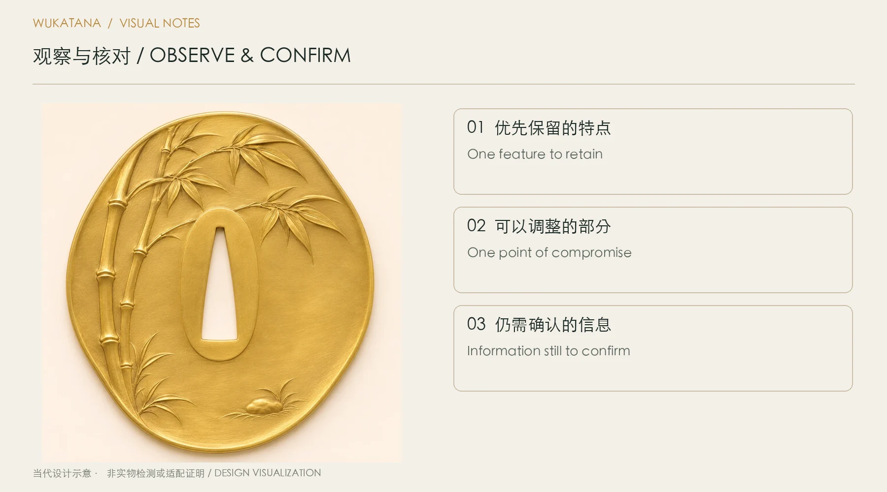
Bamboo and Stone · Bamboo Sound is cataloged as natural brass, with an organic outline form and fine engraved lines, sculpted relief as its decorative approach.
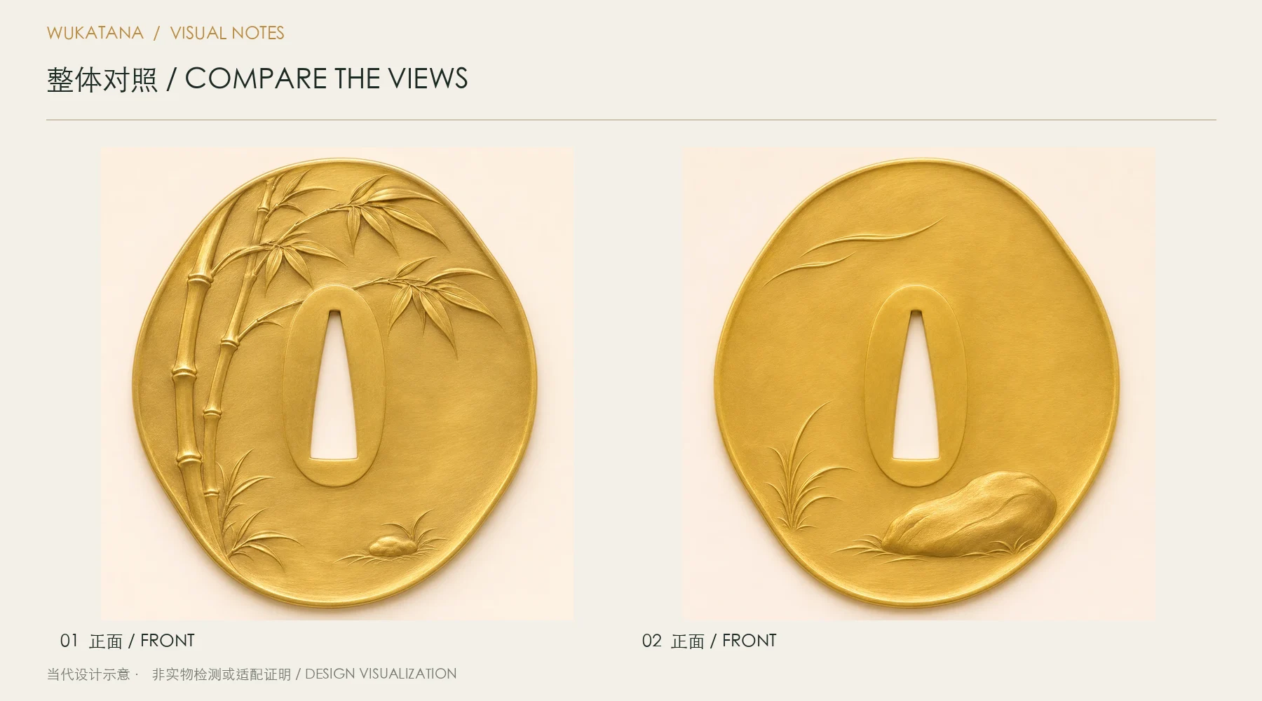
A line of bamboo, a stone without words. Bamboo and Stone · Bamboo Sound uses natural brass. Two bamboo stems rise along the left rim, opening their leaves toward the upper right.
Read the overall composition before the detail. As a candidate, this design should stand for one quality you most want to retain. Listing every attractive feature makes it harder to decide what matters when another option offers a different balance.

Second example: Bamboo and Stone · Stone Stillness
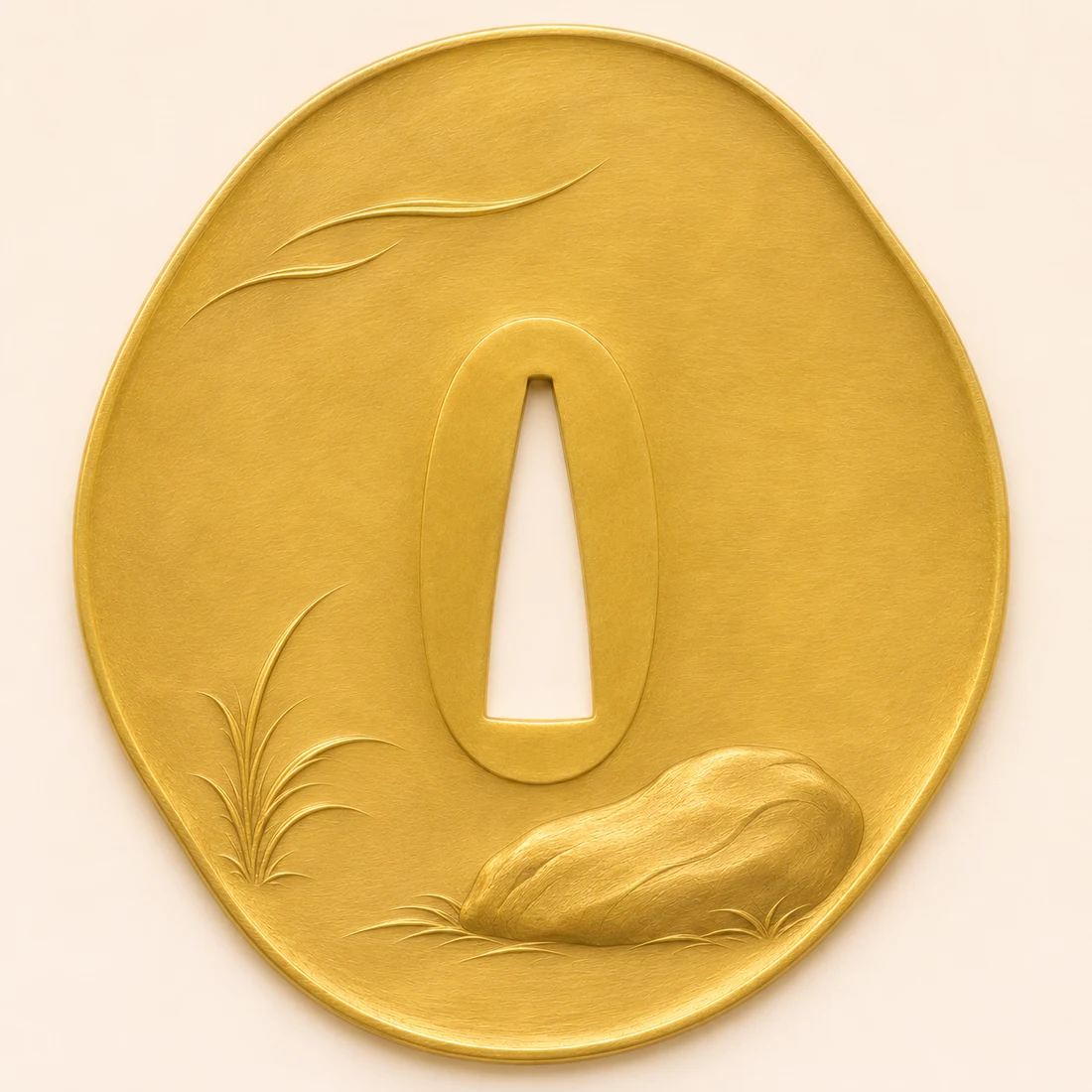
Bamboo and Stone · Stone Stillness is cataloged as natural brass, with an organic outline form and fine engraved lines, sculpted relief as its decorative approach.
A line of bamboo, a stone without words. Bamboo and Stone · Stone Stillness uses natural brass. A broad low rock rests at the lower right, balanced by slender grass and wind lines on the left.
Read Bamboo and Stone · Stone Stillness on its own terms before comparing it with the first example. Each design retains its cataloged material and composition. If material, outline, and subject change together, record those variables separately rather than attributing every visual difference to one factor.
Turn looking into a repeatable method
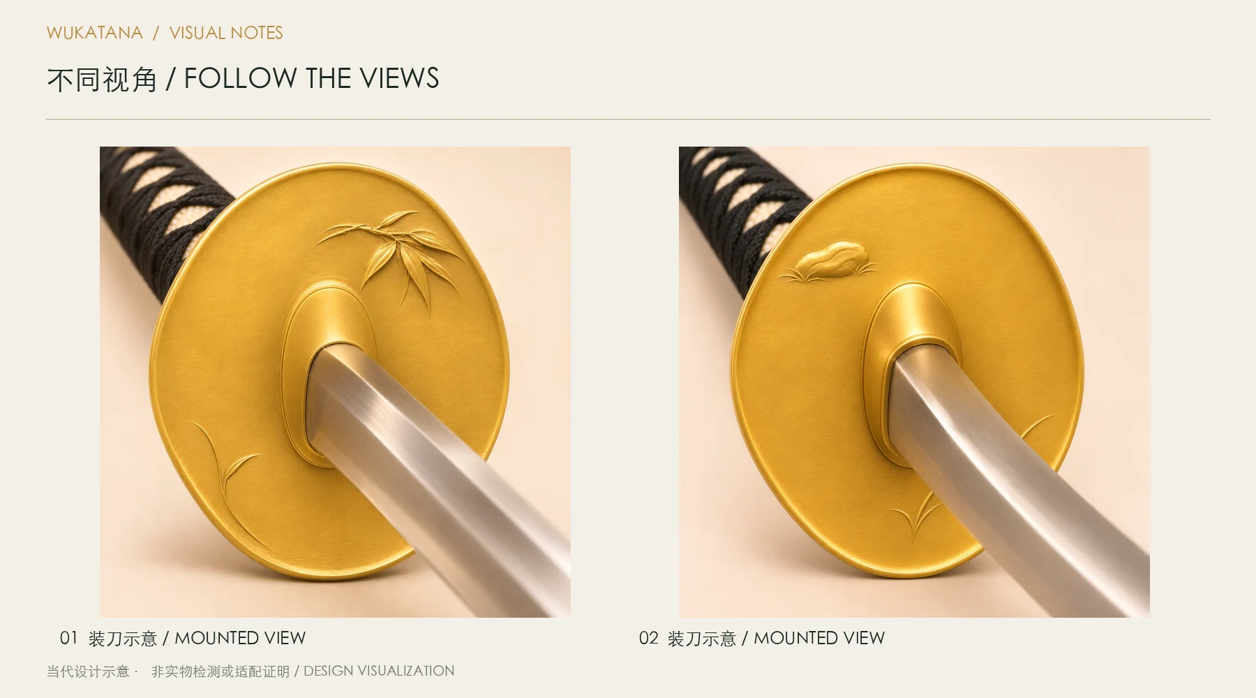
Move between a front-lit view and an oblique view. Record which details remain clear through contour alone and which depend mainly on shading.
Use images at a similar displayed height and, where possible, comparable lighting. Make three passes: first read only the outline; next record where attention settles; finally return to a mounted view and check whether that focal quality remains. Keeping those passes separate makes the reason for a preference easier to explain.
Keep one clear outcome
For fine lines and shallow relief, make the record specific to the two designs: mark the first detail you notice in Bamboo and Stone · Bamboo Sound, then identify a corresponding observation area in Bamboo and Stone · Stone Stillness. Describe the shapes and relationships first, followed by the preference or question that needs to be resolved.
End with one priority and one point on which you can compromise. You might prioritize a clear main motif while accepting a different decorative density. That decision is more useful than calling one option “more premium,” because it can be checked against the actual design and discussed without relying on a shared impression.